
Design Fundamentals
Micro-Interactions That Feel Natural
Discover how subtle animations enhance user experience without overwhelming the interface. We’re talking button hovers, loading states, and feedback animations that actually matter.
Why Micro-Interactions Matter
The best interfaces don’t feel like they’re working hard. A button that responds instantly to your click, a loading spinner that reassures rather than frustrates, a form field that gently highlights when you interact with it — these tiny moments build confidence. They’re not flashy or distracting. They’re just… right.
Micro-interactions are the invisible threads connecting intention to action. When you click something and it responds with a 200ms scale-up animation, your brain registers that instantly. The interface feels alive, responsive, and human. That’s the goal here — we’re not trying to impress anyone with elaborate animations. We’re trying to make the experience feel smooth, natural, and trustworthy.
What You’ll Learn
- Core principles of effective micro-interactions
- Timing and easing that feels natural
- Practical examples: buttons, forms, and feedback
- CSS and animation tools that work
- Common mistakes and how to avoid them
The Foundation: Timing and Easing
Timing is everything. A 50ms animation feels instant and snappy. A 300ms animation feels considered and intentional. Anything over 500ms starts to feel sluggish, like the interface is thinking too hard.
Here’s the practical breakdown: button interactions typically live in the 100-200ms range. Form validations work well at 200-300ms. Loading states benefit from slightly longer durations — 400-600ms — because you want to reassure the user something’s happening. Don’t overthink it though. Most of the time, you’re working with one or two durations across your entire interface.
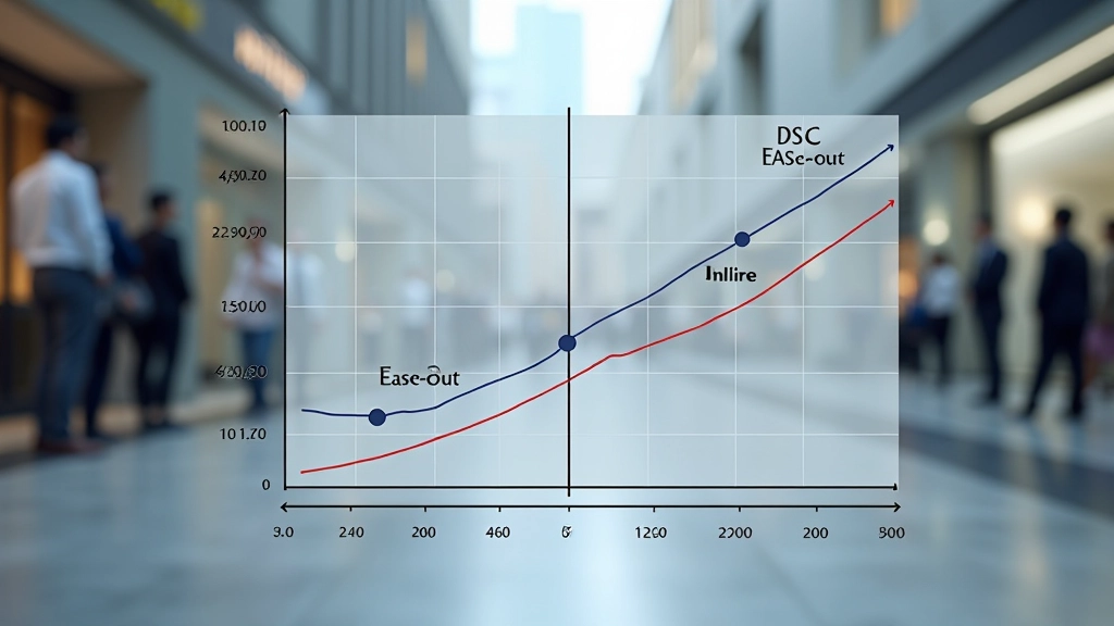
Easing functions are where the magic happens. Linear animations feel mechanical and robotic. Ease-out (fast start, slow finish) feels natural for things appearing or responding. Ease-in-out works for reversible actions like expanding and collapsing. You don’t need a library of 20 different easing curves. Three or four do the job.

Button Interactions: The Basics Done Right
Buttons are where most people start with micro-interactions. They’re simple enough to understand but complex enough to get wrong. Let’s talk about what actually works.
A solid button interaction has three states: default, hover, and active (pressed). The hover state should be visible within 100-150ms. A subtle scale transform — something like 1.05x — combined with a slight color shift gives immediate feedback. The active state (when you’re actually clicking) should feel even more responsive, maybe a 0.95x scale to suggest the button being pressed down.
Don’t add unnecessary animations to the inactive state. The button should sit there quietly until someone interacts with it. When they do hover, respond instantly. When they click, respond even faster. It’s about making the interface feel responsive to human intention, not decorating everything with motion.
Important Note
This article provides educational guidance on micro-interaction design principles. Implementation details vary based on your specific project requirements, browser compatibility needs, and performance constraints. Always test animations on actual devices and consider accessibility requirements (reduced-motion preferences) when deploying to production. Consult with your team’s performance and UX guidelines for final implementation decisions.
Form Feedback That Builds Confidence
Forms intimidate users. There’s always that moment of uncertainty: “Did I fill this out correctly? What happens when I submit?” Micro-interactions can dissolve that tension.
When someone focuses on an input field, add a subtle border animation — maybe a 2px bottom border that fades in over 150ms. It signals that the field is active without being aggressive. If there’s validation happening in real-time, use color and gentle motion to communicate success or errors. A green checkmark that fades in next to a valid email field is reassuring. A red warning that shakes slightly tells the user something’s wrong, but the motion is gentle enough that it doesn’t feel like the interface is shouting.
After submission, show a confirmation state. This could be a spinner that rotates at a steady 1 rotation per 2 seconds (not too fast, not too slow), or a progress bar that fills smoothly over the expected load time. Users want to know something’s happening. A well-executed loading animation is worth far more than radio silence.

Loading States and Transparency
Loading states are where users judge whether your interface is trustworthy. A static spinner looks broken. A spinner that rotates smoothly tells users the system is working. The difference is 200 lines of CSS animation.
Skeleton loading is even better. Instead of a generic spinner, show a faded outline of what’s coming. Imagine a list of article cards loading — show the user the card structure (headline area, image area, metadata area) in a light gray, then fade in the real content as it arrives. It’s not just faster-feeling, it’s more honest. The user sees exactly what’s being loaded before it appears.
Timing matters here too. If something loads in under 200ms, don’t show a loading state at all — just let it appear. If it takes 200-1000ms, show a subtle spinner. Over 1000ms, definitely show a skeleton or progress indicator. This prevents loading states from feeling like they’re slowing things down.
Bringing It Together
Micro-interactions aren’t about showing off. They’re about respect — respecting the user’s time, attention, and intelligence. When you get the timing right, choose appropriate easing, and respond instantly to interaction, the interface disappears. People don’t think “wow, that animation was smooth.” They just think “that worked exactly like I expected it to.”
Start simple. Pick one interaction in your current project and make it exceptional. Get the timing right. Choose the right easing. Test on real devices. Then move on to the next one. That’s how you build interfaces that feel natural. Not through complexity, but through attention to detail.

Related Articles

Planning Animations Before You Code
Read Article